
What if over half of your potential customers were standing outside your shop, but the door was locked? In 2026, that is exactly what happens when your site isn’t optimized for phones. With mobile devices now accounting for over 60% of global web traffic, you might wonder, why do i need a mobile friendly website if my desktop site still works? The reality is that Google now uses mobile-first indexing for 100% of websites. If you aren’t mobile-ready, you don’t exist in search results.
We know the technical jargon like responsive design feels overwhelming. You don’t need to spend thousands of dollars or wait months for a developer to fix your online presence. At FunckyTunky.com, we believe website building should be fast, easy, and stress-free. We promise to show you how to launch a professional, stunning site that works on every phone automatically in under 24 hours. No coding is required, and no technical headaches are allowed.
This guide busts five common myths that keep business owners stuck with outdated sites. We will show you how to get better rankings without learning SEO and how to secure more sales without a custom app. Your 24-hour transformation starts right now.
Key Takeaways
- Stop losing the 60% of web traffic that now browses exclusively on mobile devices.
- Discover why do i need a mobile friendly website to stay visible on Google and avoid being hidden on page 10.
- Forget slow agency projects and learn how to launch a fully responsive site in just 24 hours.
- Identify the hidden costs of waiting and how to gain a massive edge over your competitors.
- Switch to modern responsive design effortlessly without writing a single line of code.
Myth 1: ‘My Customers Only Use Desktops to Find Me’
Many business owners still believe their industry is “different.” They assume clients only sit at a large desk to search for their services. This is a costly mistake in 2026. Statistics show that over 60% of all web traffic now comes from mobile devices. If you are still asking yourself, why do i need a mobile friendly website, the answer is simple: your customers have already moved to their phones. They are searching while they commute, while they wait for coffee, and while they relax at home.
A mobile-friendly site means your layout and functions work perfectly on a smartphone screen. It isn’t just a shrunken version of your desktop site. It’s a specialized experience for the Mobile web that respects the user’s time and thumb-space. Whether you sell retail products or high-end corporate legal advice, your first impression happens on a five-inch screen. If that experience is clunky, your brand looks outdated.
In the past, B2B companies thought they were safe because business usually happens at a desk. That is no longer true in 2026. Modern executives use their phones to vet vendors while traveling or during lunch breaks. If your site is hard to navigate, they will move to a competitor who makes it easy. You aren’t just competing on price anymore. You are competing on accessibility and ease of use. Stop making it hard for people to give you money.
These “micro-moments” happen hundreds of times a day. A potential client has a problem and wants an answer in under ten seconds. If they have to pinch and zoom to read your text, they are gone. Speed and clarity are the new currency for business growth. You need to be ready the exact second a customer needs you. Our 24-hour website builder ensures you never miss a lead again.
The Shift in User Behavior
Mobile devices have completely replaced physical directories and yellow pages for local discovery. When people need a plumber or a lawyer, they don’t wait to get home to their computer. They search right now. We also see a massive “couch-surfing” effect. Even for major life purchases, people do their initial research on their phones while watching TV. A bad mobile experience feels like a closed door to your shop. It tells the customer you aren’t ready for their business, so they move on to someone who is.
Google’s Mobile-First Indexing Explained
Mobile-first indexing is Google’s default method of using the mobile version of your content to determine where your site ranks in search results. If your mobile site is poor, Google effectively ignores your desktop version. Your search visibility will tank, even if your desktop site looks amazing. This directly hurts your brand authority and makes it impossible for new clients to find you. You need a site that works on every device, and you need it fast. Our platform handles this automatically, giving you a professional site in under 24 hours.
Myth 2: ‘I Need a Separate Mobile App or Website’
Many business owners believe they need a custom app or a second “mobile-only” site to succeed. This is a common misunderstanding of how modern technology works. In the past, companies used “m.dot” sites like m.yourbusiness.com. These were separate versions of the main site that required double the work to maintain. Today, that approach is dead. It creates duplicate content issues and confuses your visitors. You don’t need two websites; you need one site that is smart enough to adapt.
You might ask, why do i need a mobile friendly website when I could just build a custom app? The reality is that building a professional app is a massive cost trap. Apps can cost thousands of dollars and take months to develop. Most customers won’t download an app just to see your menu or check your hours. They want information fast, directly from their mobile browser. According to Top Website Statistics For 2025, users prefer seamless browser experiences over cluttered app stores. An app creates a barrier; a responsive website creates an open door.
Responsive design is the modern gold standard. It uses one single codebase that reshapes itself based on the screen size. Whether your visitor is on a massive desktop monitor or a tiny smartphone, the site looks perfect. This is great for SEO because you only have one URL to promote. It’s even better for your schedule because you only have one site to update. Our website builder at FunckyTunky.com uses these smart templates to do the heavy lifting for you. You don’t need to learn a single line of code to look like a pro.
One Site, Every Device
Fluid grids and flexible images are the secret sauce of a modern site. They allow your content to flow like water into any container. You don’t have to worry about buttons being too small or text being unreadable. If a visitor has to “pinch-and-zoom” to see your contact form, you’ve already lost them. A responsive site ensures everything is tap-friendly and clear. Having one URL for all your marketing makes your social media and email campaigns much more effective. You can start building your responsive site right now and see the difference immediately.
The Death of the ‘Mobile-Only’ Version
Managing two separate sites is a total nightmare for busy owners. If you change a price on your desktop site, you shouldn’t have to remember to change it on a mobile version too. Modern builders ensure your content syncs across all screens instantly. FunckyTunky.com takes this a step further. We don’t just give you a mobile version; we give you a site that is built to win on every device from day one. You can build once and launch everywhere in under 24 hours. It’s the fastest, most efficient way to stay competitive without the high cost of custom development.
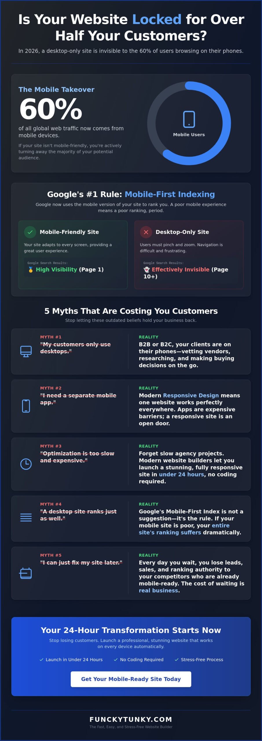
Myth 3: ‘Mobile Optimization is Too Expensive and Slow’
Waiting months for a mobile-ready site is a relic of the past. You don’t need to hire an expensive agency for a three-month overhaul that costs up to $8,000. Many business owners still ask, why do i need a mobile friendly website right now? They worry about the price tag. But the real cost is the revenue you lose every day your site fails to load on a smartphone. A 1-second delay in mobile page load time can slash your conversions by 20%. That is money leaving your pocket while you wait for a developer to call you back.
Even government agencies are moving toward this mobile-first mindset. They’ve shifted From pageviews to progress to ensure everyone can access services on any device. If the public sector is prioritizing mobile speed, your business should too. Automated tools don’t mean your site will look generic. Modern templates are stunning, professional, and fully optimized for 2026 standards. You get the look of a custom-coded site without the custom-coded price or the long wait times.
The math is simple. If 53% of mobile users leave a site that takes more than three seconds to load, an old desktop site is a massive liability. You aren’t just saving money by using a faster builder; you’re protecting your future sales. Stop viewing mobile readiness as a luxury. It’s a survival requirement that you can check off your to-do list by tomorrow morning.
How to Launch a Mobile Site in 5 Steps
You can go from zero to a live, mobile-optimized site faster than you think. Follow these simple steps to get results:
- Step 1: Choose a mobile-responsive template that fits your specific business niche.
- Step 2: Upload your content using our intuitive, no-code tools.
- Step 3: Preview your site on simulated phone and tablet screens to ensure it’s perfect.
- Step 4: Use built-in SEO tools to verify your mobile readiness and speed.
- Step 5: Go live in under 24 hours and start reaching more customers.
Saving Time for Entrepreneurs
Your time is your most valuable asset. Don’t waste your weekends struggling with code or learning how to fix broken layouts. You need a mobile first website builder that handles the technical side for you. Focus on your sales and marketing. Let our tools manage the screen resolutions and loading speeds. With 24/7 support, you’re never alone. You can build your site fast and get back to what you do best. Your business doesn’t stop, and your website shouldn’t either. Start now and see your new site live in 24 hours.
Myth 4: ‘A Desktop Site Ranks Just as Well on Google’
Google changed the rules for good. As of 2024, they use mobile-first indexing for 100% of websites. This means your desktop site is effectively invisible to search engines if the mobile version fails. If you’re still wondering, why do i need a mobile friendly website, look at your search rankings. A site that works poorly on a phone will be pushed to page 10. Google primarily uses the mobile version of your content to determine where you rank for all searches, even those done on a desktop.
Speed is a massive ranking factor in 2026. If your page takes longer than three seconds to load, 53% of mobile users will abandon it. Google tracks this behavior. High bounce rates signal that your site isn’t useful, which destroys your visibility. This also impacts your local ‘Map Pack’ ranking. When customers search for ‘near me’ services, Google prioritizes fast, responsive sites. If you aren’t mobile-ready, you aren’t on the map. You’re losing local leads to competitors who look better on a five-inch screen.
Mobile UX is now a direct reflection of your customer trust. When a site is hard to use, people assume the business is unprofessional or out of date. You don’t want to be the business that looks like it’s stuck in 2010. Modern users expect a seamless experience. They want to find your phone number, see your prices, and book your services with one or two taps. If you make them work for it, they’ll leave. Using high-performance responsive website templates ensures your site meets these modern expectations right out of the box.
Core Web Vitals for Beginners
You don’t need to be a tech expert to understand search rankings. Google looks at Core Web Vitals to judge your site. Largest Contentful Paint (LCP) is just a fancy way of saying “how fast the main stuff loads.” If your main image or text takes too long to appear, users leave. Cumulative Layout Shift (CLS) measures if buttons or links jump around when a user tries to tap them. Our website builder optimizes these technical details automatically. You get a high-performance site that satisfies Google’s robots without touching any code. If you want to go further, a modern website design builder gives you the tools to meet every Core Web Vitals benchmark while keeping your brand looking polished and professional.
Trust and Credibility Factors
Professionalism is judged in a heartbeat. Most users decide if they trust your business in under three seconds. A broken mobile layout makes your business look like it’s already closed. It creates a sense of neglect. On the other hand, a clean, fast site builds instant authority. Mobile-friendly contact forms are also critical. If a customer can’t tap to call or fill out a form easily, they’ll find a competitor who makes it simple. Don’t let a bad layout kill your sales. Build your website fast and launch a professional, SEO-ready site in under 24 hours.
Myth 5: ‘I Can Just Fix My Site Later’
Procrastination is the silent killer of small business growth. You might think you can wait another quarter to update your digital presence, but every single day you delay is a day you hand your revenue to a competitor. If you are still asking, why do i need a mobile friendly website right now, look at how fast your industry is moving. You wouldn’t ignore a leak in your physical roof; don’t ignore the leak in your digital sales funnel. A non-responsive site is essentially a “closed” sign for the majority of the internet.
The gap between you and your rivals grows every hour. In 2026, customers have zero patience for slow or broken layouts. If your competitor has a site that loads instantly and yours requires pinching and zooming, they win the lead. It is that simple. Switching to a modern, responsive platform is no longer a massive, months-long project. It is a quick decision that changes your business trajectory. You can stop the loss of leads today by choosing a mobile first website builder that puts mobile users first.
The Cost of Inaction
Waiting has a real price tag that impacts your bottom line. Industry data shows that roughly 88% of users who have a bad mobile experience are less likely to return to that site. You aren’t just losing a single sale; you are losing the lifetime value of that customer. If you run social media ads, the stakes are even higher. Since approximately 90% of social media browsing happens on phones, sending that traffic to a desktop-only site is like throwing your marketing budget away. There is also a snowball effect with your SEO. The longer your bounce rate remains high, the harder it becomes to recover your rankings later.
Start Your 24-Hour Launch Now
Fixing your mobile problem doesn’t have to be a headache. You don’t need to learn how to code or spend weeks planning a complex redesign. FunckyTunky.com is designed for busy entrepreneurs who need results immediately. Our website builder handles the technical optimization so you don’t have to. You get a stunning, professional site that works on every screen size automatically. Here is your final checklist to be 2026 ready:
- Responsive design that adapts to all phone and tablet screens instantly.
- Load times under three seconds to keep visitors engaged.
- Clear, tap-friendly buttons and easy-to-read text.
- Built-in SEO tools to maintain your Google rankings.
- Seamless contact forms for instant lead generation.
Stop waiting for the “perfect time” to fix your site. That time is right now. You can launch your mobile-friendly site in 24 hours with FunckyTunky.com and start winning back your customers today. Build your site fast, stay optimized, and watch your business grow.
Take the Fast Track to Mobile Success
The digital landscape has shifted for good. Your customers are already on their phones; Google is looking at your mobile site first. You’ve seen the myths busted. You don’t need a massive budget, months of waiting, or complex coding skills to win. The real question is no longer why do i need a mobile friendly website, but how quickly you can adapt to keep your business growing. Every hour you wait is a missed opportunity to connect with a new lead.
You can solve this problem by tomorrow morning. Our Google-optimized templates handle the technical work for you. There is absolutely no coding required. Our 24/7 customer support is always ready to help you cross the finish line. Don’t let technical stress hold your business back. It’s time to launch a stunning, fast, and professional site that works on every device automatically. Using a modern website design builder means you can achieve a high-performance, SEO-optimized result that builds immediate trust without needing to be a tech expert. You have the tools to succeed right here.
Build Your Mobile-Responsive Site in 24 Hours and take control of your online presence. Your future customers are searching for you right now. Let’s make sure they can find you. You can do this!
Frequently Asked Questions
How do I check if my website is mobile-friendly?
Open your site on a smartphone and try to navigate your menus. If you find yourself pinching the screen to read text or squinting at tiny buttons, your site isn’t mobile-friendly. You can also use browser developer tools to simulate different phone screens. A truly optimized site has large, tap-friendly buttons and clear text that fits the screen perfectly without any horizontal scrolling.
Is a mobile-friendly website different from a responsive website?
Mobile-friendly is the goal while responsive design is the modern way to get there. A responsive site uses one single layout that automatically stretches or shrinks to fit any screen size perfectly. Older “mobile-friendly” sites sometimes used a separate, limited version of the main site that was hard to maintain. Today, responsive design is the gold standard because it keeps all your content in one place.
Can I turn my existing website into a mobile-friendly one quickly?
You can upgrade your presence by moving your content to a modern responsive website templates platform. Trying to “patch” an old, non-responsive site with custom code is often slow and expensive. If you’re asking why do i need a mobile friendly website that’s built from scratch, it’s about long-term reliability. You can launch a fresh, optimized site in under 24 hours using our intuitive, no-code tools.
Will a mobile-friendly website improve my local SEO rankings?
Yes, a mobile-ready site is a major factor for local search success in 2026. Google prioritizes businesses that offer a great mobile experience when users search for local services on the go. If your site is fast and easy to use on a phone, you’re much more likely to appear in the coveted “Map Pack” results. This leads to more calls and visits from local customers.
Do I need to pay extra for a mobile version of my site?
You shouldn’t pay a cent extra for a mobile version. In 2026, mobile responsiveness is a standard feature of any professional website builder. It’s not a luxury or a “premium” add-on anymore. Every template we offer is built to look stunning on phones and desktops right out of the box. You get one professional site that works everywhere for one simple price.
What happens if my website is not mobile-friendly in 2026?
You will likely see a massive drop in your search engine rankings and visitor trust. You might wonder why do i need a mobile friendly website if your desktop traffic seems steady. The reality is that Google now uses the mobile version of your site to rank you for all searches. If that version is missing or broken, your business will become invisible to most of the internet.
How long does it take to build a mobile-responsive website from scratch?
You can build a professional, mobile-responsive site in under 24 hours. Our platform is designed for speed so you don’t have to spend weeks waiting on a developer to call you back. You just pick a template, add your info, and go live. It’s a hassle-free process that gets your business back in front of customers almost instantly with a stunning new look.
Can I manage my mobile-friendly website from my phone?
Yes, you can manage your entire site directly from your smartphone. Our website maker is fully optimized for mobile users on both ends. You can update your text, swap out images, or check your site analytics while you’re away from your desk. This gives you the freedom to run your business from anywhere without being tied to a computer or office.